
Move Away From Touchscreen UI (nitpicking)
2 posters
Page 1 of 1

Move Away From Touchscreen UI (nitpicking)
![]() by VisibleDucts Wed 28 Jan - 17:24
by VisibleDucts Wed 28 Jan - 17:24
This is kind of nitpicking and not meant to be a "This NEEDS changed" but a suggestion.
Currently, the desktop beta (which it being beta, I'm not sure what is currently placeholder text/etc, so if some of this is already in the works, just not priority for the current beta, well, obviously you can ignore this ^^. Which, as a side note, it would be nice to see a roadmap type thing where we can see what the plans are from here/know more about the current beta and the goals you're working toward and maybe some direction in what you would like from us players in regards to feedback. Obviously bugs, but besides that, I mean. I guess having a forum abut UI Suggestions implies you want to know about what people think of the UI. But maybe if you guys have time, make a post (if I missed it, I apologize) about what you would love to hear from us about when it comes to feedback. I know I'm super excited to be part of the beta and any feedback I give is in hopes I help you guys in any way I can.)
...That was a long side note. So, I'll start that sentence over: Currently, the desktop beta uses terminology and UI/mechanics that feel appropriate for a touchscreen, but aren't (in my opinion) optimized for desktops. The most obvious is during the tutorial the first instruction is "To reach the space station, tap it then tap "Orbit""
Obviously, this isn't really a big deal (although from reading a lot of reviews on Steam, I've seen a lot of mobile ports harshly reviewed for things as minor as this. People seem to approach mobile ports looking for things that "show" the devs didn't spend any time on optimizing the port for desktops.), "tap" is terminology for touchscreen devices and makes it clear that the game was developed for mobile platforms. For the desktop version of Out There, you might consider going through and updating all the terms that are used for mobile platforms to terms that would make more sense on desktops (like "click" instead of "tap" maybe.).
The "tapping" also shows up in a game play mechanic/UI. Specifically, you need to "tap" (click) on planets and solar systems to find out information about them. While, again, this isn't' a big deal and not really even a mobile specific mechanic, minimizing the amount of clicking isn't always a bad thing either. And with desktops, you can implement hover popups, where instead of having to click to see what a planet/solar system is, that information is displayed when you hover your mouse over it.
Lastly, during the opening scene where it shows the pilot in stasis and tells the back story, currently you have to click the arrow on the text box to proceed to the next text box. It would be more convenient, I think, to allow clicking anywhere to work, opposed to just the one point on the screen opposed to using a small arrow as the only place to click.
All of this is really nitpicky and not game breaking at all. The reason I'm posting this feedback is just in case you find it helpful. Not to say you're doing anything wrong or any of this NEEDS to be changed. So take my suggestions as just that, suggestions. it's rare for me to post feedback and when I do it tends to be kind of like this. Not necessarily anything big or important. Just things I thought of while playing and if I love the game a lot, I'll post whatever thoughts I have just in case I say something helpful. So it's nitpicky, but none of it really bothers me, it's just thoughts that I had while playing that I thought wouldn't hurt to share. Hope that makes sense.
Sorry this is a long post and I hope this doesn't feel like a waste of time reading ^^. I really love Out There. It's a beautiful game/piece of art. Thank you for making it!
Currently, the desktop beta (which it being beta, I'm not sure what is currently placeholder text/etc, so if some of this is already in the works, just not priority for the current beta, well, obviously you can ignore this ^^. Which, as a side note, it would be nice to see a roadmap type thing where we can see what the plans are from here/know more about the current beta and the goals you're working toward and maybe some direction in what you would like from us players in regards to feedback. Obviously bugs, but besides that, I mean. I guess having a forum abut UI Suggestions implies you want to know about what people think of the UI. But maybe if you guys have time, make a post (if I missed it, I apologize) about what you would love to hear from us about when it comes to feedback. I know I'm super excited to be part of the beta and any feedback I give is in hopes I help you guys in any way I can.)
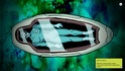
...That was a long side note. So, I'll start that sentence over: Currently, the desktop beta uses terminology and UI/mechanics that feel appropriate for a touchscreen, but aren't (in my opinion) optimized for desktops. The most obvious is during the tutorial the first instruction is "To reach the space station, tap it then tap "Orbit""
- Tutorial Image:

Obviously, this isn't really a big deal (although from reading a lot of reviews on Steam, I've seen a lot of mobile ports harshly reviewed for things as minor as this. People seem to approach mobile ports looking for things that "show" the devs didn't spend any time on optimizing the port for desktops.), "tap" is terminology for touchscreen devices and makes it clear that the game was developed for mobile platforms. For the desktop version of Out There, you might consider going through and updating all the terms that are used for mobile platforms to terms that would make more sense on desktops (like "click" instead of "tap" maybe.).
The "tapping" also shows up in a game play mechanic/UI. Specifically, you need to "tap" (click) on planets and solar systems to find out information about them. While, again, this isn't' a big deal and not really even a mobile specific mechanic, minimizing the amount of clicking isn't always a bad thing either. And with desktops, you can implement hover popups, where instead of having to click to see what a planet/solar system is, that information is displayed when you hover your mouse over it.
Lastly, during the opening scene where it shows the pilot in stasis and tells the back story, currently you have to click the arrow on the text box to proceed to the next text box. It would be more convenient, I think, to allow clicking anywhere to work, opposed to just the one point on the screen opposed to using a small arrow as the only place to click.
- Opening image:
All of this is really nitpicky and not game breaking at all. The reason I'm posting this feedback is just in case you find it helpful. Not to say you're doing anything wrong or any of this NEEDS to be changed. So take my suggestions as just that, suggestions. it's rare for me to post feedback and when I do it tends to be kind of like this. Not necessarily anything big or important. Just things I thought of while playing and if I love the game a lot, I'll post whatever thoughts I have just in case I say something helpful. So it's nitpicky, but none of it really bothers me, it's just thoughts that I had while playing that I thought wouldn't hurt to share. Hope that makes sense.
Sorry this is a long post and I hope this doesn't feel like a waste of time reading ^^. I really love Out There. It's a beautiful game/piece of art. Thank you for making it!
VisibleDucts- Posts : 1
Join date : 2015-01-28
Re: Move Away From Touchscreen UI (nitpicking)
![]() by MichaelP Thu 29 Jan - 15:54
by MichaelP Thu 29 Jan - 15:54
Hi VisibleDucts,
That's the kind of feedback we want, thank you!
I'm aware that we need to adapt the mobile UI for its transition to PC. That's why I've created this topic.
I won't give instructions for the time being as I want 'natural' reactions from testers while they're playing the game.
That's the kind of feedback we want, thank you!
I'm aware that we need to adapt the mobile UI for its transition to PC. That's why I've created this topic.
I won't give instructions for the time being as I want 'natural' reactions from testers while they're playing the game.
MichaelP- Posts : 212
Join date : 2014-01-07
Page 1 of 1
Permissions in this forum:
You cannot reply to topics in this forum